

GṺNO Coffee — Brand & Packaging Design
GṺNO is inspired by the Turkish shorthand for “günaydın” — meaning good morning. The brand playfully embraces the irony behind mornings with the line:
For people who hate mornings.
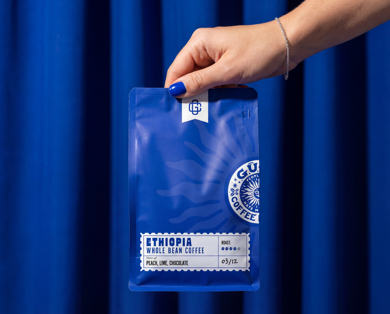
The packaging system combines a bold cobalt blue bag with a subtle sun-inspired watermark and a glossy sticker-style logo seal, creating a clean yet expressive identity for a modern specialty coffee brand.
Minimal typography and a strong color presence keep the focus on the ritual itself — great coffee that makes mornings a little more bearable.
Drop a ❤️ if you hate mornings too.


Let's talk.
Got a brand to launch, a product to shape, or a website that needs to actually work hard? Drop us a line and we'll get back to you with something concrete — not just "we'll be in touch".